
I’ve been blessed to be able to make illustrations for a myriad of excellent companies in my career.
Herein are a few examples.
Covenant Eyes Illustration
This is a recent illustration for Covenant Eyes. CE is an excellent organization that is on a noble mission to help improve marriages, families, and the culture at large. It was an honor and a privilege to be a part of the messaging for their products.
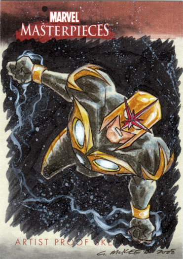
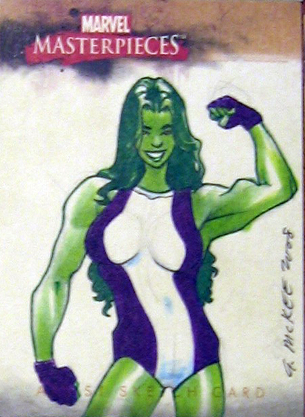
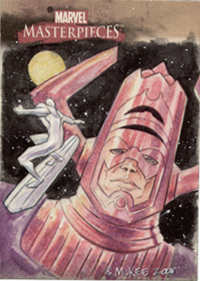
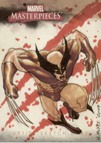
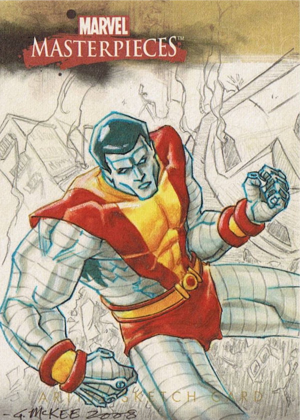
Marvel Masterpieces
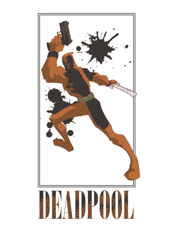
Marvel and Upperdeck published the Marvel Masterpieces collectible cards and the art director for that set assigned some of the Sketch cards to me. it was a fun set to do and a real kick to work on those iconic Marvel characters.
The advantage to an “Odds and Ends” page is that I’m able to put in some fun illustration projects that I normally wouldn’t place along with my design work.
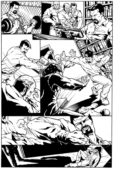
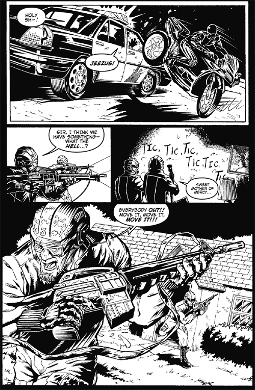
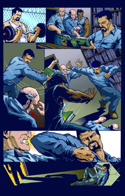
Black Rose Graphic Novel
This is a comic for which I did the pencilling and layout, Keith Barnett inked, and Mike Torrance Colored. Although a bit dated, it does demonstrate an ability to tell a story visually. And that is a skill set that has broad application throughout design and illustration.
The Joy Kills
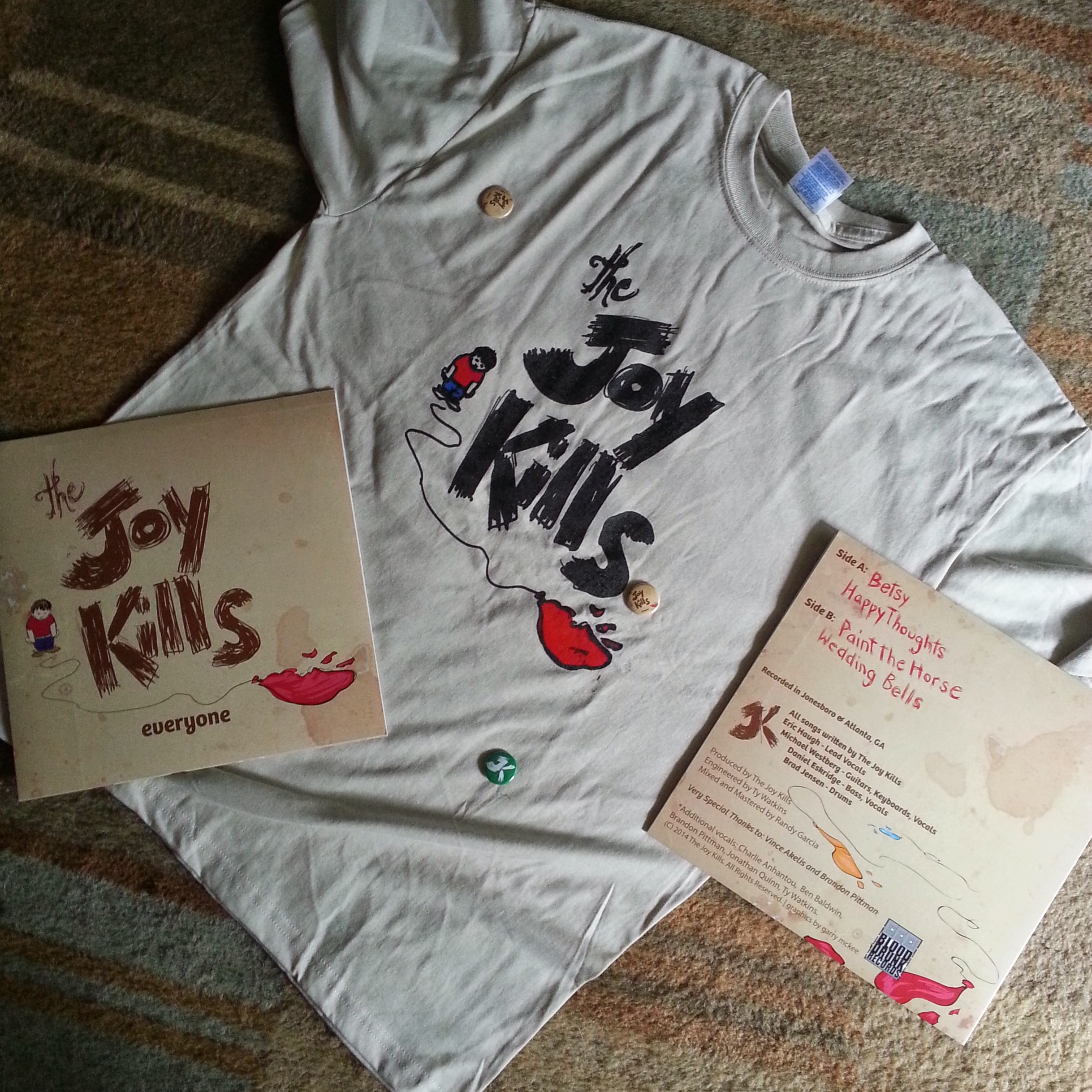
My most formative years were spent in the age of CD’s. Naturally, I thought the opportunity to design a cover for a vinyl album was really gone before I even got into my first design course in college.
But then an old friend of mine contacted me about doing some design work for this band releasing its first vinyl album. I was very excited to get started until I got the description of the desired graphics. The brief was a very detailed description involving multiple angles and vantage points from which to view the scene.
Wanting to please the client (UX/UI Designers tend to be pleasers) I sketched for days based on the brief.
But try as I might, I just couldn’t make good sense of the imagery described. As the deadline loomed, I decided to just do work based on the band name “The Joy Kills”, the lyrics of the songs, and the sound of the music. The sketches were finally coming alive! The result was a simple, rather sloppy, illustration of a kid with a popped balloon on a stained background. The band identity was hand drawn text as well. The client was shocked at the difference between the convoluted description and the designs that I presented. They all ultimately loved the designs and felt that it captured exactly the right look and feel. The final thrill of this job was getting my comps of the album and collateral materials.
Some Fun Some Kicks
& Some Commissioned Pics
Over the years, I’ve done a slew of illustrations for a variety of companies as well as individual commissions that don’t easily fit into other areas of my portfolio anymore. But there are some interesting and entertaining images that may be interesting to some audiences.
Veritas Academy
Veritas Academy is where my children have received an unparalleled education in the classics of western civilization, history, art, music, theology, logic and rhetoric. It is also where our family has found friends and strong support for those cultural values that are actually worth conserving. I had the opportunity to design their logo around 2008 and to refresh it for an overhaul again in 2015. This is used on signage, uniforms, and collateral material across the brand.
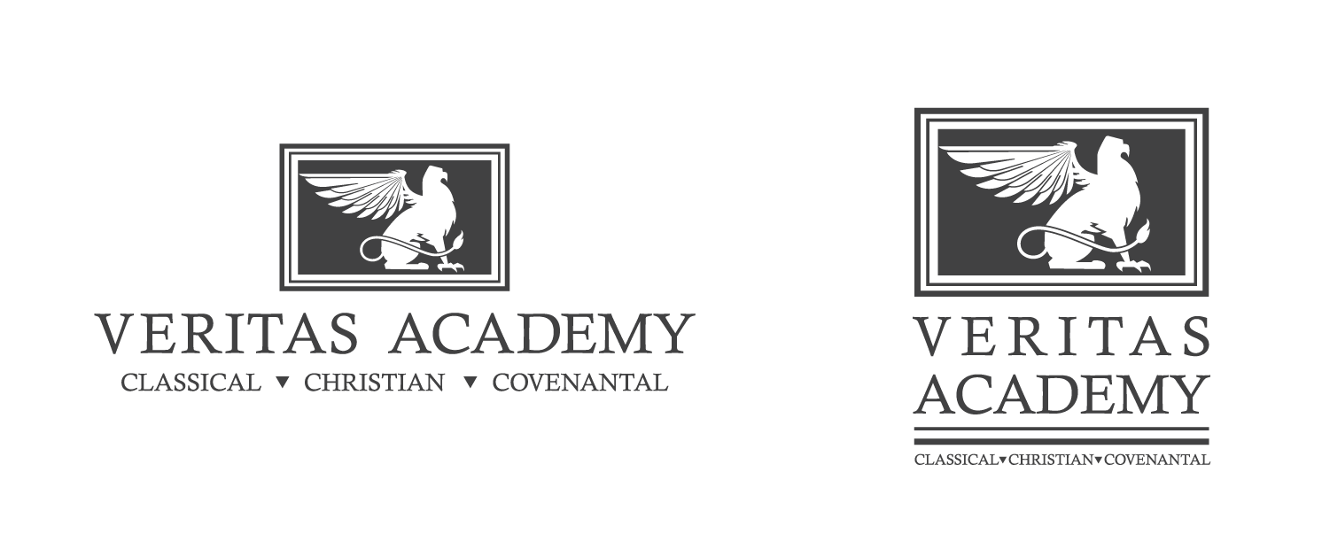
as Veritas consists of three schools: Grammar, Logic and Rhetoric. These correspond with what we think of as elementary, middle and high school today. Each of these schools were given their own icons to represent them within the school in the original 2008 designs.
The concept was to break the powers of the mascot, the Griffon, into various parts that correlate to the focus of development within the respective schools.
Wings are the most basic need of creatures of flight. Thus the grammar school were referred to as Wings. This is where they learn to read, write, respect authority, and begin learning Latin (3rd grade.)
Talons are that which the creature needs to begin to provide for itself. This corresponds to the logic school in which our students learn to think critically and evaluate practical, philosophical, and theological concepts.
The Prow represents the part of the creature that displays to the world as complete and formidable. The rhetoric school builds upon the grammar and logic to give the student the ability to use their knowledge and skills to serve their fellow man and glorify God.
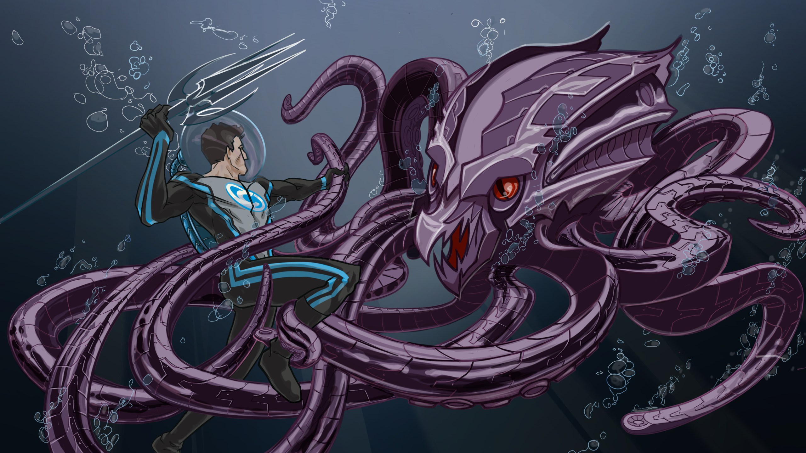
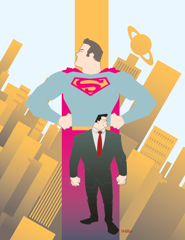
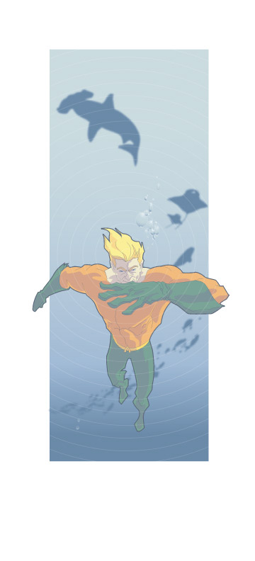
Vector Heroes!
These were all sheer fun projects to work on over the years.
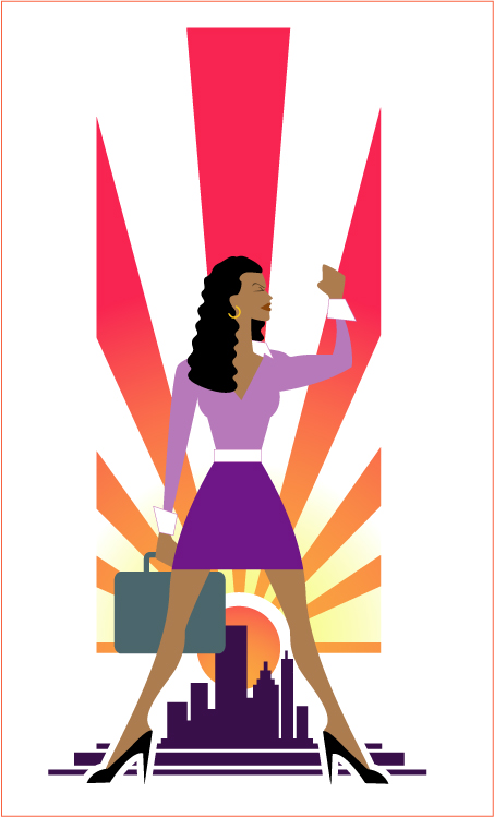
StoryMiners Illustrations
Mike Whittenstein and his StoryMiners firm are amongst the most incredible people I have had the pleasure of working with. The series of illustrations done for them included both vector and raster based digital illustrations.