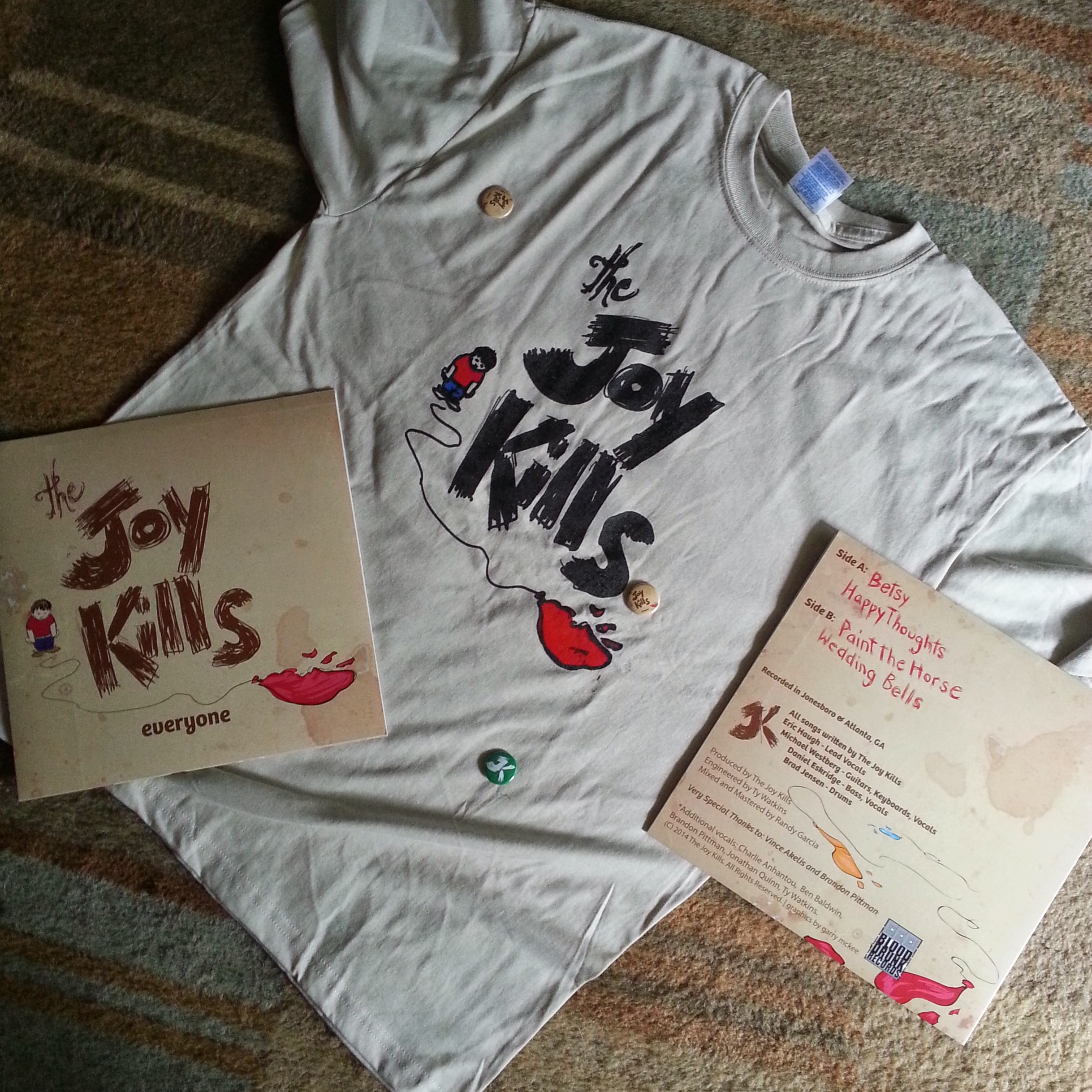
Pure joy to be able to do an illustration and jacket design for an actual vinyl album for a wild, but talented band.
The Joy Kills
My most formative years were spent in the age of CD’s. Naturally, I thought the opportunity to design a cover for a vinyl album was really gone before I even got into my first design course in college.
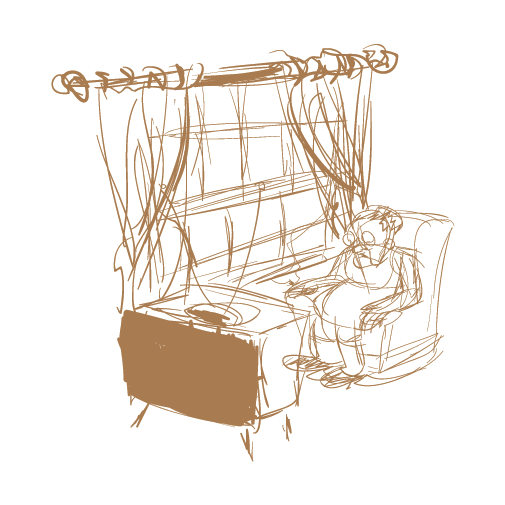
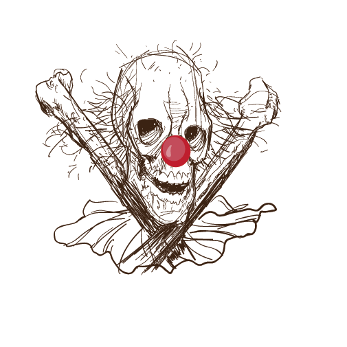
But then an old friend of mine contacted me about doing some design work for this band releasing its first vinyl album. I was very excited to get started until I got the description of the desired graphics. The brief was a very detailed description involving multiple angles and vantage points from which to view the scene.
Wanting to please the client (UX/UI Designers tend to be pleasers) I sketched for days based on the brief.
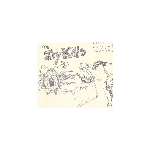
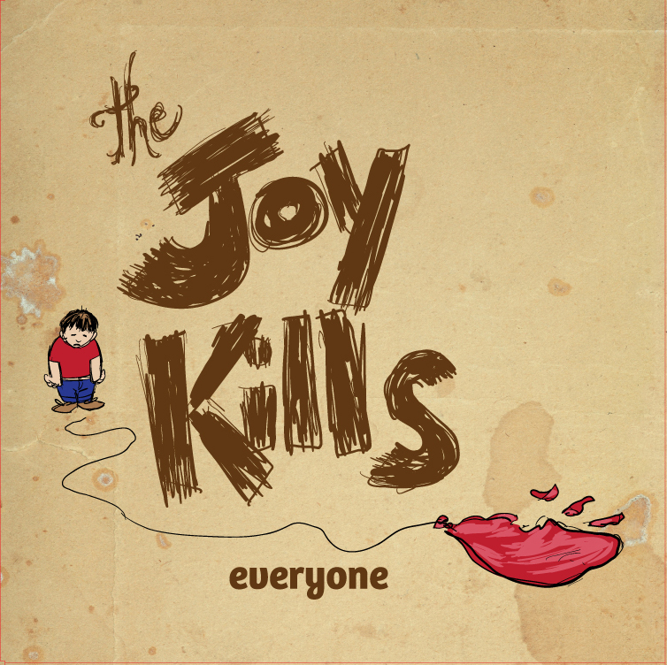
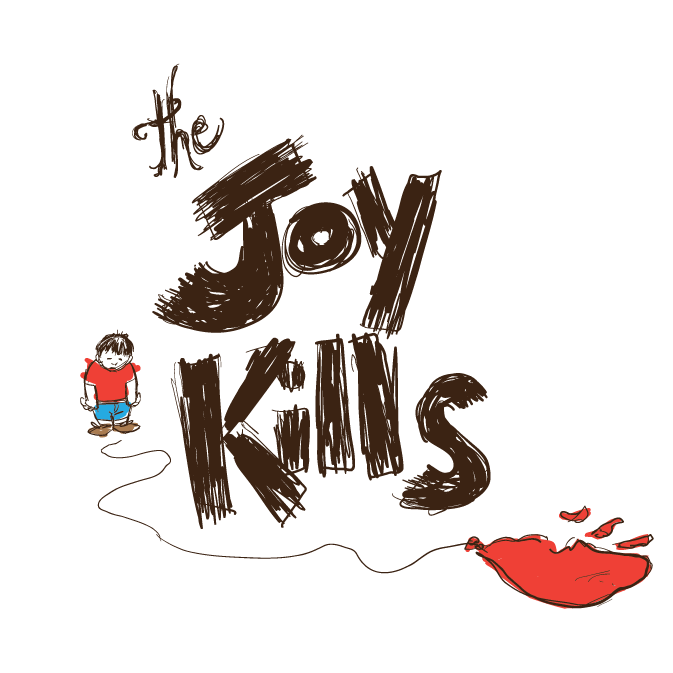
But try as I might, I just couldn’t make good sense of the imagery described. As the deadline loomed, I decided to just do work based on the band name “The Joy Kills”, the lyrics of the songs, and the sound of the music. The sketches were finally coming alive! The result was a simple, rather sloppy, illustration of a kid with a popped balloon on a stained background. The band identity was hand drawn text as well. The client was shocked at the difference between the convoluted description and the designs that I presented. They all ultimately loved the designs and felt that it captured exactly the right look and feel. The final thrill of this job was getting my comps of the album and collateral materials.